1.3 Histogram With Unequal Class Intervals
Grouped frequency table are sometimes given with unequal class intervals because a particular range
of the variate may be of special interest.
If you do this, care has to be exercised in calculating the true class limits as age in the table below is
measured differently from other variates. e.g. \(18-20\) includes people who are just 18 to those one day less
than 21.
Since the eyes compares area and not height in a histogram the areas of the blocks must be
proportional to class frequency
\(\therefore \) height of block \(\alpha \) \(\frac {\text {class frequency}}{\text {class width}}\)
The ratio \(\frac {\text {class frequency}}{\text {class width}}\) is known as the frequency density.
| Class | True Class | Class | frequency | frequency | Relative |
| Interval | Limit | Width | \((.000)\) | Density | Frequency |
| \(16-17\) | \(16-18\) | 2 | 4 | 2 | \(8.316\times 10^{-1}\) |
| \(18-20\) | \(18-21\) | 3 | 73 | 24.33 | 0.1518 |
| \(21-24\) | \(21-25\) | 4 | 185 | 46.25 | 0.3846 |
| \(25-29\) | \(25-30\) | 5 | 104 | 20.8 | 0.2162 |
| \(30-34\) | \(30-35\) | 5 | 34 | 6.8 | 0.0707 |
| \(35-44\) | \(35-44\) | 10 | 33 | 3.3 | 0.0686 |
| \(45-54\) | \(45-55\) | 10 | 22 | 2.2 | 0.0457 |
| 55 and above | 55 and above | 20 | 26 | 1.3 | 0.0540 |
| \(55-75\) | \(55-75\) | ||||
Construct a (1) Histogram (2) Ogive curve
1.3.1 Stem-and-Leaf Plots
A stem-and-leaf plot provides an alternative to a line plot or histogram for obtaining a picture of the data distribution when data can be represented as integer (counting) numbers.
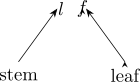
The method of construction:
\(\bullet \) Find the largest and smaller scores. They are best explained in the context of an example.
Example 1.12. Make a stem and leaf plot of the algebra test scores given below.
| 56 | 65 | 98 | 82 | 64 | 71 | 78 | 77 | 86 |
| 69 | 70 | 80 | 92 | 76 | 82 | 85 | 91 | 92 |
| 95 | 99 | 91 | 73 | 59 |
Solution.
- \(\bullet \)
- Since the data ranges from 56 to 99, the stems range from 5 to 9.
- \(\bullet \)
- To plot the data, make a vertical list of the stems.
- \(\bullet \)
- Each number is assigned to the graph by pairing the units digit, or leaf, with the correct stem.
- \(\bullet \)
- The score 56 is plotted by placing the units digit, 6, to the right of stem 5.
| Stem | |||||||
| 5 | 6 | 9 | |||||
| 6 | 4 | 5 | 9 | ||||
| 7 | 0 | 1 | 3 | 6 | 7 | 8 | |
| 8 | 0 | 2 | 2 | 5 | 6 | ||
| 9 | 1 | 1 | 2 | 2 | 5 | 8 | 9 |
- \(\bullet \)
- The stem-and-leaf represents a histogram when turned vertically.
- \(\bullet \)
- The lowest score on the algebra test is 56.
- \(\bullet \)
- The highest score on the algebra test is 99.
- \(\bullet \)
- The interval in which most students scored is 90 to 99.
Data with more than two digits can be rounded to two digits before plotting or can be truncated to two digits. For a stem and leaf plot, you would truncate everything after the second digit.
- \(\bullet \)
- The number 355 would round to 36.
- \(\bullet \)
- The number 355 would truncate to 35.
Box Plots
- \(\bullet \)
- Provides a visual representation of a five-number summary of data, consisting of the median (the midpoint of the data range), the upper and lower quartiles (the numbers below the highest quarter of the data and above the lowest quarter, respectively) and largest and smallest values (the extremes).
- \(\bullet \)
- Box plots are particularly useful for comparing distributions of the results from several
experimental conditions.
“Because box plots are based on simple summaries, they can be used with fairly young children
certainly third graders”
Constructing the graph:
- Step 1:
- Determine the five-number summary (lower extreme, lower quartile, median,upper quartile and upper extreme).
- Step 2:
- Construct a number line that includes the extremes.
- Step 3:
- Mark the position of the five numbers in the summary a little above the number line.
- Step 4:
- Draw a narrow box that connects the quartiles. Draw a line through the box at the median.
Draw lines from the ends of the boxes to the extremes (“Whiskers”).
Example 1.13. The number of sit-ups eighteen students managed in one minute is recorded below. Find the five number summary and draw a box plot.
| 49 | 58 | 57 | 43 | 46 | 35 | 42 | 56 | 50 |
| 47 | 45 | 45 | 43 | 51 | 36 | 41 | 50 | 48 |
Solution. Order the values first. Nothing about quartiles makes sense until you do.
| 35 | 36 | 41 | 42 | 43 | 43 | 45 | 45 | 46 | 47 | 48 | 49 | 50 | 50 | 51 | 56 | 57 | 58 |
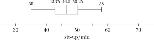
Here \(n=18\), so using the rule of the previous section: \begin {align*} Q_1 &=\tfrac {1}{4}(n+1)\text {th}=4.75\text {th value}=42+0.75(43-42)=42.75\\ Q_2 &=\tfrac {1}{2}(n+1)\text {th}=9.5\text {th value}=\tfrac {1}{2}(46+47)=46.5\\ Q_3 &=\tfrac {3}{4}(n+1)\text {th}=14.25\text {th value}=50+0.25(51-50)=50.25 \end {align*}
The lower and upper extremes are simply the smallest and largest values, \(35\) and \(58\). Written in order of lower extreme, lower quartile, median, upper quartile and upper extreme, the five number summary is:
| 35 | 42.75 | 46.5 | 50.25 | 58 |
Notice that the box covers only \(42.75\) to \(50.25\). Half the class sits inside a range of about seven and a half sit-ups, while the whiskers stretch much further on both sides. That is what a box plot is for: it shows at a glance where the bulk of the data is.
A box plot of these numbers, plotted above the real number line for reference, would look like the following:
Questions on this section
Stuck on something here? Ask below and it stays attached to this topic.