1.1 Discrete Data
Discrete data can take only separate, particular values, with gaps between them. Between any two
neighbouring values there is nothing a measurement could land on. Such data usually arise from
counting.
Discrete data arise wherever something is counted rather than measured. Marks obtained in a test, the number of passengers on a bus and the number of students in a class are all of this kind: each can only be a whole number, and there is nothing between one value and the next.
Discrete data are usually presented as a pie chart, a bar chart or a pictograph.
Definition 1.3 (Bar chart). A bar chart represents each category by a bar whose length is proportional to its frequency. The bars are drawn with equal widths and with gaps between them.
Note 1.4. The gaps matter, and are not decoration. They signal that the categories are separate and that nothing exists between them. A histogram, used for continuous data, has bars that touch for exactly the opposite reason – there the horizontal axis is a continuous scale with no gaps in it. Drawing a bar chart without gaps quietly claims the data are continuous when they are not.
Several forms are in common use, each answering a different question:
- 1.
- Simple bar chart – one bar per category. Best when the only question is which categories are larger.
- 2.
- Multiple (grouped) bar chart – categories are compared across two or more groups, with the bars for each group placed side by side. Good for comparing groups category by category, for instance enrolment by programme in each of three years.
- 3.
- Component (stacked) bar chart – each bar is divided into parts, so the whole and its composition are shown together. Good when the total matters as well as the split, but comparing the middle segments across bars is hard, because they do not start from a common baseline.
- 4.
- Percentage component bar chart – as above, but every bar is scaled to the same height. This compares composition across groups of very different sizes, at the cost of hiding those sizes entirely.
- 5.
- Horizontal bar chart – the same as a simple bar chart, turned on its side. Worth using when category names are long, since they can then be read normally rather than rotated.
Whichever form is chosen, the frequency axis must start at zero. A bar chart is read by comparing lengths, so cutting the axis short exaggerates the differences between bars and misrepresents the data.
Example 1.5. The following eighteen values were recorded. Would a frequency table listing every distinct value be a sensible summary?
| 24 | 42 | 23 | 14 | 20 | 28 | 72 | 13 | 34 |
| 60 | 9 | 4 | 18 | 15 | 13 | 8 | 10 | 51 |
Solution. No. Of the eighteen observations, seventeen are distinct – only 13 occurs twice. A table listing every value would have seventeen rows, almost all with a frequency of 1, and would be no shorter or clearer than the raw list.
The difficulty is the range: from 4 to 72, that is 68 wide. When the range is large relative to the number of observations, individual values must be collected into classes:
| Class | \(0\)–\(9\) | \(10\)–\(19\) | \(20\)–\(29\) | \(30\)–\(39\) | \(40\)–\(49\) | \(50\)–\(59\) | \(60\)–\(69\) | \(70\)–\(79\) |
| \(f\) | 3 | 6 | 4 | 1 | 1 | 1 | 1 | 1 |
Eight rows instead of seventeen, and now the shape is visible: most values are small, with a thin tail stretching to the right.
The cost is that the individual values are lost – the class \(10\)–\(19\) records six observations but no longer says which. That is the trade every grouped table makes, and it is why the mean computed from grouped data later in this chapter is only an estimate.
Remark 1.6. The contrast with the next example is the point. There the scores run from \(0\) to \(5\) over 30 students, so a handful of values repeat many times and a tally of individual values is exactly right. Here the values barely repeat at all and grouping is unavoidable. Whether to group is decided by the data, not by preference.
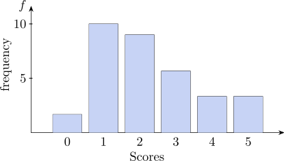
The total scores of 30 students out of 5 are given below:
| 3 | 1 | 3 | 2 | 2 | 1 | 1 | 3 | 1 | 1 | 5 | 3 | 3 | 2 | 0 |
| 4 | 2 | 1 | 2 | 5 | 3 | 1 | 2 | 2 | 1 | 1 | 2 | 4 | 2 | 1 |
We can present this type of data in a table called frequency table.
The difference between the lowest value and highest value is 5
| Score | Tally Mark | \(f\) frequency |
| 0 |  | 1 |
| 1 |   | 10 |
| 2 |   | 9 |
| 3 |   | 6 |
| 4 |  | 2 |
| 5 |  | 2 |
Bar Chart
Questions on this section
Stuck on something here? Ask below and it stays attached to this topic.